ラベル ggplot の投稿を表示しています。 すべての投稿を表示

2021年5月15日土曜日

HiraKakuPro-W3 scale_fill_hue tidyr  gather 日本語 行列 matrix axis.ticks.x axis.text.x How to erase x-axis lable X軸のラベルを消すには 横並び 棒グラフ


  1. 都道府県別データから指定された期間の新規陽性者データを抜き出す。
  2. 抜き出したデータをベクターに変換し、都道府県の人口で割り人口あたりの新規陽性者データを算出する。
  3. 算出したデータを行列、さらにdata frame に変換する。
  4. 3. をtidyr::gather を使用してggplot 用に変換する。
  5. X軸テキスト消去の参考にしたのはこちら


len <- 90
target <- c(1,13,27,40,47)
data <- mdf
# wdf <- ( ((mdf[,-48] %>% last(.,len) %>% t() %>% as.vector()) /rep(as.vector(pref_pop[,1]) ,len) %>% matrix(.,nrow=47) %>% t() %>% data.frame() )%>% cbind(.,t=last(mdf$t,len)) ) <- BUG
# wdf <-  ((mdf[,-48] %>% last(.,len) %>% t() %>% as.vector()) /rep(as.vector(pref_pop[,1]) ,len) %>% matrix(.,nrow=47)) %>% t() %>% data.frame() %>% cbind(.,t=last(mdf$t,len))
wdf <- ((data[,-48] %>% last(.,len) %>% t() %>% as.vector()) /rep(as.vector(pref_pop[,1]) ,len) %>% matrix(.,nrow=47)) %>% t() %>% data.frame() %>% cbind(.,t=last(data$t,len))
colnames(wdf)[-48] <- pref_en
# df <- (wdf %>% tidyr::gather(reg_name,value,-t))
df <- (wdf %>% tidyr::gather(reg_name,value,target))
p <- ggplot(df,aes(x=t, y=value,fill=reg_name)) 
# p <- p +scale_fill_brewer(palette="Accent")
# p <- p+geom_bar(stat="identity",width=1,position = "fill")
p <- p+geom_bar(stat="identity",width=1,position = "dodge")
# p <- p + geom_histogram(bins=len,position = "fill", alpha = 0.9)

p <- p + theme_gray (base_family = "HiraKakuPro-W3")
p <- p + scale_fill_hue(name="都道府県",labels=pref_jp[target])
p <- p + theme(panel.background = element_rect(fill = "grey90",
                                               colour = "lightblue"))
plot(p)


wdf[,-48] %>% apply(.,2,sum)
df <- wdf[,-48] %>% apply(.,2,sum)
df <- data.frame(df)
df <- cbind(df,region=rownames(df))

p <- ggplot(df, aes(x = region, y = df, fill = region))
p <- p + geom_bar(stat = "identity")
p <- p + theme_gray (base_family = "HiraKakuPro-W3")
# p <- p + theme(axis.ticks.x=element_line(size=8))
p <- p + theme(axis.ticks.x=element_blank())
# p <- p + theme(axis.text.x=element_blank())
# p <- p + theme(axis.text.x=element_line(size=8)) # NG
p <- p + ylab("人口千人あたり") + xlab("")
p <- p + scale_fill_hue(name="都道府県",labels=pref_jp)
p <- p + scale_x_discrete(label=substr(pref_jp,1,1))
p <- p+theme(legend.position = 'none')    # legend terminate 凡例 消去
p <- p + theme(axis.text.x = element_text(angle = 90, hjust = 1))  # x軸 縦書き
plot(p)

"p <- p + theme(axis.text.x = element_text(angle = 90, hjust = 1))"でラベルを横倒し縦書きにできる。


2020年1月23日木曜日

The relationship between cli 1month delta and eps quarter over quater growth.


1) t.test

t.test between grop of cli delta is minus and plus. result is there is only 0.019% probability that those two groups posess same mean value. This result means they are different groups each other.


t.test(
diff(eps_year_xts,1)["2001::2018"][ apply.quarterly(diff(cli_xts$usa),mean)["2001::2018"] > 0],
diff(eps_year_xts,1)["2001::2018"][ apply.quarterly(diff(cli_xts$usa),mean)["2001::2018"] < 0]
)


# Welch Two Sample t-test

# data:  diff(eps_year_xts, 1)["2001::2018"][apply.quarterly(diff(cli_xts$usa),  and diff(eps_year_xts, 1)["2001::2018"][apply.quarterly(diff(cli_xts$usa),     mean)["2001::2018"] > 0] and     mean)["2001::2018"] < 0]
# t = 3.9531, df = 66.145, p-value = 0.0001903
# alternative hypothesis: true difference in means is not equal to 0
# 95 percent confidence interval:
#  3.115924 9.474840
# sample estimates:
# mean of x mean of y 
#  4.117125 -2.178257 


2) spot diagram


diff(eps_year_xts,1)["2001::2018"][ apply.quarterly(diff(cli_xts$usa),mean)["2001::2018"] > 0]
df <- data.frame(
cli=as.vector(apply.quarterly(diff(cli_xts$oecd),mean)["2001::2018"]),
eps=as.vector(diff(eps_year_xts,1)["2001::2018"]),
sign=as.vector(year(index(diff(eps_year_xts,1)["2001::2018"])))
)
p <- ggplot(df, aes(x=cli,y=eps,color=sign))
p <- p + geom_point(alpha=0.5)
p <- p + geom_smooth(method = "lm")
plot(p)


3)histgram

func <- function(x){if(x > 0){return("p")}else{return("m")}}
df <- data.frame(eps=round(as.vector(diff(eps_year_xts,1)["2001::2018"]),digits=2),
sign=as.vector(apply(apply.quarterly(diff(cli_xts$usa),mean)["2001::2018"],1,func)))
# parameter ase() better be put into a single line.
p <- ggplot(df, aes(x=eps,fill=sign))
p <- p + geom_histogram(bins=50,position = "identity", alpha = 0.5)
plot(p)


2019年10月8日火曜日

MOV and VIX on each months.


# 各月のCOVを計算して棒グラフにする。
# COVのデータを遡って、12で割り切れる最長のデータ長を計算する。
# データ長に基づいて、配列を作成し、それを数=12の行列に代入する。(行数=12でなくてはならない。注意!)
# apply(行列,1,mean)を実行して、月ごとの平均を計算する。
# 最終COVの月を計算して、データの並びを変える。最終月が10月なら、3,4,5,6,7,8,9,10,11,12,1,2となるように並べる。


df <- data.frame(cov=apply(matrix(last(COV,floor(length(COV)/12)*12),nrow=12),1,mean)[c(last(seq(1,12,1),month(last(index(COV)))),seq(1,(12 - month(last(index(COV)))),1))],
month=factor(seq(1,12,1)))
p <- ggplot(df,aes(x=month,fill=month))
p <- p + geom_bar(aes(y=cov),stat='identity')
p <- p + scale_x_discrete(label=c("jan","feb","mar","apr","may","jun","jul","aug","sep","oct","nov","dec"))  #x-axis label
p <- p + theme(legend.position = 'none')  # erase legend
plot(p)


df <- data.frame(cov=apply(matrix(last(VIX[,4],floor(length(VIX[,4])/12)*12),nrowncol=12),12,mean)[c(last(seq(1,12,1),month(last(index(VIX[,4])))),seq(1,(12 - month(last(index(VIX[,4])))),1))],
month=factor(seq(1,12,1)))
p <- ggplot(df,aes(x=month,fill=month))
p <- p + geom_bar(aes(y=cov),stat='identity')
p <- p + scale_x_discrete(label=c("jan","feb","mar","apr","may","jun","jul","aug","sep","oct","nov","dec"))  #x-axis label
p <- p + theme(legend.position = 'none')  # erase legend
plot(p)


2019年9月17日火曜日

SPX from 2000 + residual with eps model price + CLI 1 month delta.


SPX from 2000 + residual with eps model price + CLI 1 month delta.

kikan <- "2000-01-01::"
func <- function(x){
  if(is.na(x)){return(NA)}
  if(x > 0.1){return("a")}
  if(x > 0){return("b")}
  if(x > -0.1){return("c")}
  if(x < -0.1){return("d")}
}

delta <- append(as.vector(diff(cli_xts$oecd)[kikan]),rep(NA,length(index(tmp.predict)) - length(diff(cli_xts$oecd)[kikan])))
#  [kikan]
df <- data.frame(i=as.vector(tmp.predict[kikan][,4]),
g=as.vector(tmp.predict[kikan][,6]),
e=as.vector(tmp.predict[kikan][,7]),
r=as.vector((tmp.predict[kikan][,4]/tmp.predict[kikan][,7])-1)*5000,
# c=as.vector(apply(diff(cli_xts$oecd)[kikan],1,func)),
c=as.vector(apply(matrix(delta,ncol=1),1,func)),
t=as.Date(index(tmp.predict[kikan])))

colnames(df)[1] <- 'i'
colnames(df)[2] <- 'g'
colnames(df)[3] <- 'e'
colnames(df)[4] <- 'r'
colnames(df)[5] <- 'clidelta'

p <- ggplot(df,aes(x=t))
#
# need to investigate mapping= designator. somehow it's necessary to overlay y-axis coordinated graph.
#

p <- p + geom_point(mapping=aes(y=i,colour=clidelta),stat="identity", position="identity",size=0.8)
p <- p + geom_path(aes(y=i),stat="identity", position="identity",colour="black",linetype="dotted")
p <- p + scale_x_date(date_breaks = "2 year", date_labels = "%Y")
# same as above about mapping=
p <- p + geom_path(aes(y=g),colour='red')
p <- p + geom_path(aes(y=e),colour='blue')
p <- p+annotate("text",label=as.character("10%"),x=as.Date("2020-01-01"), y=550,colour='black')
p <- p + geom_hline(yintercept = 250,size=0.5,linetype=1,colour="white",alpha=1)
p <- p+annotate("text",label=as.character("5%"),x=as.Date("2020-01-01"), y=300,colour='black')
p <- p + geom_hline(yintercept = -250,size=0.5,linetype=1,colour="white",alpha=1)
p <- p+annotate("text",label=as.character("-5%"),x=as.Date("2020-01-01"), y=-200,colour='black')
p <- p + geom_bar(aes(y=r,fill=clidelta),stat = "identity",colour="black") # need identity to draw value itself.

p <- p + theme(axis.title.x=element_blank(),axis.title.y=element_blank())
p <- p + labs(title = "SPX + Theory + Residual% + CLI 1 month Delta",fill="CLI Delta",colour = "CLI Delta")
p <- p +scale_color_brewer(palette="Spectral",na.value = "black",name = "CLI Delta", labels = c("High","mid High","mid Low","Low","NA"))
p <- p +scale_fill_brewer(palette="Spectral",na.value = "black",name = "CLI Delta", labels = c("High","mid High","mid Low","Low","NA"))
p <- p+theme( rect = element_rect(fill = "grey88",
                                  colour = "black",
                                  size = 0,
                                  linetype = 1),
              panel.background = element_rect(fill = "grey88",
                                              colour = "lightblue"),
              axis.title.x=element_blank(),
              axis.title.y=element_blank()
              )
# p <- p + scale_fill_discrete(name="Experimental\nCondition")
# p <- p +scale_colour_discrete(name  ="CLI Delta") + scale_shape_discrete(name  ="CLI Delta")

plot(p)
# remove unnecessary function.
remove(func)
remove(df)


ggplot() histogram by 8 colors.


  • categorize cli delta into 8 groups as to equalize the number of each group as much as possible.
    • count total number.
    • calculate "should be" number of each group.
    • find watermark according to the expected number of iteration.
    • in "func()" and mapply, to put mark "a" to "g" on each month
  • make histogram with  "stack" parameter.
  • remove unnecessary objects.

func <- function(z,a,b,c,d,e,f,g){
  w <- watermark
  x <- z
  if(is.na(x)){return(NA)}
  if(x > a){return("a")}
  if(x > b){return("b")}
  if(x > c){return("c")}
  if(x > d){return("d")}
  if(x > e){return("e")}
  if(x > f){return("f")}
  if(x >= g){return("g")}
  if(x < g){return("h")}
  return(x)
}


# spx_mean <- apply.monthly(SP5[,4],mean)["1970::"]
cov <- apply.monthly(SP5[,4],sd)/apply.monthly(SP5[,4],mean)["1970::"]
lag <- 5
delta <- append(as.vector(diff(cli_xts$oecd,lag)[paste(substr(as.Date(head(index(cov),1)),1,7),"::",sep="")]),rep(NA,length(index(cov)) - length(diff(cli_xts$oecd,lag)[paste(substr(as.Date(head(index(cov),1)),1,7),"::",sep="")])))
# calculate threshold. output 7 thresholds for 8 groups. store into watermark
# use mapply shown in the sample when data.frame() is done.
# when number of colors =8 floor(length(na.omit(delta))/##9##)*seq(2,##8##,1)
watermark <- sort(delta,decreasing = T)[floor(length(na.omit(delta))/9)*seq(2,8,1)]
# mapply(func,delta,watermark[1],watermark[2],watermark[3],watermark[4],watermark[5] )
df <- data.frame(
  i=as.vector(cov),
  # when number of colors =8 watermark[1] till watermark[7] are used.
  c=as.vector(mapply(func,delta,watermark[1],watermark[2],watermark[3],watermark[4],watermark[5],watermark[6],watermark[7])),
  t=as.Date(index(cov)))


p <- ggplot(df, aes(x=i,fill=factor(c)))
# p <- p + geom_histogram(bins=80,position = "stack", alpha = 0.9)
# p <- p + geom_histogram(bins=160,position = "fill", alpha = 0.8)
p <- p + geom_histogram(bins=160,position = "stack", alpha = 0.8)
# p <- p +scale_fill_brewer(na.value = "grey50",name = "CLI Delta", labels = c(as.character(round(watermark,digits=2)),"Less than above","NA"))
legendlable <- c(paste("more than ",as.character(round(watermark,digits=2)),sep=""),"Less than above","NA")
legendlable
p <- p +scale_fill_brewer(palette="Spectral",na.value = "grey50",name = "CLI Delta", labels = legendlable)
p <- p + theme(axis.title.x=element_blank(),axis.title.y=element_blank())
p <- p + theme(panel.background = element_rect(fill = "black",
                                               colour = "lightblue"))
               # panel.grid = element_blank())
# p <- p +scale_fill_brewer(palette="Spectral",na.value = "grey50",name = "CLI Delta", labels = c(as.character(round(watermark,digits=2)),"Less than above","NA"))

plot(p)
# remove(s)
# remove(df)
remove(watermark)
remove(delta)
remove(cov)


2019年9月16日月曜日

ggplot() sample


dataframe を準備

  • 異なる種類のデータを統合するときはこのdata frame作成時にやる。
  • カラム名がggplot()内部での変数名となるので、注意!
df <- data.frame(
  i=as.vector(cov),
  c=as.vector(mapply(func,delta,watermark[1],watermark[2],watermark[3],watermark[4],watermark[5],watermark[6],watermark[7])),
  t=as.Date(index(cov)))

ggplot作成の第一歩

データフレームおよび基礎データの指定

  • データとして使用するデータフレームを指定する。
  • aes()でいろいろな見た目パラメータを指定する。ここではfillで塗りつぶし色を決定する基準を指定している。
  • 離散量で指定したいときはfactor()を使用する。
  • その中で順序を指定したい時はlevels パラメターを使用する。そこでoriginalが取りうる値とその相互の順序を指定する。
    • xlables <- factor(original,levels=c("2-F--64", "2-F-65-", "2-M--64", "2-M-65-", "2-U--64", "2-U-65-", "2-U-UNK","1-F--64", "1-F-65-", "1-M--64", "1-M-65-", "1-M-UNK", "1-U--64", "1-U-65-", "1-U-UNK")) 
  • 連続量を使うときはnumericなどの型のデータをそのまま指定すれば良い。
  • y軸と違いx軸は大概の場合、常に共通なので、aes(x=<column name of data frame>) を使ってここで指定すると良い。
  • 以降はオブジェクト p に対して更新を行う。
    p <- ggplot(df, aes(x=i,fill=factor(c)))

グラフの種類およびyデータの指定

  • ぞれぞれ棒グラフの作成、分散図の作成、線グラフの作成する。
  • aes(y=<column name of data fram>,,,)の形でデータフレームのカラム名のうち適当なものをy軸のデータとして指定する。
  • 色を付けたい場合はaes(fill=<column name of data frame>)などとする。
  • geom_segment()は任意の2つの座標の間に線分を引く
p <- p + geom_bar(aes(y=r),stat = "identity",fill='pink',colour="black") # need identity to draw value itself.
p <- p + geom_point(aes(y=i),stat="identity", position="identity",colour="green",size=0.8)
p <- p + geom_path(aes(y=i),stat="identity", position="identity",colour="black",linetype="dotted")
p <- p + geom_segment(x=as.Date("1985-01-01"),y=log(168),xend=as.Date("2019-09-01"),yend=log(3000),color='white',size=0.02,linetype=2)

棒グラフに色をつけたい場合。

この例ではfillとcolor(colour)双方をつかっている。詳細はscale_color_brewer()scale_fill_brewer()で追加の設定を行う。
p <- p + geom_bar(aes(y=r,fill=clidelta),stat = "identity",colour="black") # need identity to draw value itself.
p <- p + geom_point(mapping=aes(y=i,colour=clidelta),stat="identity", position="identity",size=0.8)
色指定したいデータについて使用するパレットとそれぞれの色値に対する説明を入力する。fillの場合はこのscale_fill_brewer()を使う。 scale_fill_discrete()とかscale_colour_discrete()あるがよくわからないことがまだ多いので、注意して使うこと。
legendlable <- c(paste("more than ",as.character(round(watermark,digits=2)),sep=""),"Less than above","NA")
p <- p +scale_fill_brewer(palette="Spectral",na.value = "grey50",name = "CLI Delta", labels = legendlable)

ヒストグラムの色々

  • 目的に応じて、"identity","stack","fill" それぞれのパラメータを指定する。
  • ヒストグラムのx軸に連続量を指定する場合、離散量を指定する場合で結果が全く異なるので注意すること。
p <- p + geom_histogram(aes(fill=sign),position = "identity", alpha = 0.3,bins=120)
p <- p + geom_histogram(bins=50,position = "fill", alpha = 0.9)
p <- p + geom_histogram(bins=80,position = "stack", alpha = 0.9)

X軸の間隔指定

Date型のときに使用する。
p <- p + scale_x_date(date_breaks = "2 year", date_labels = "%Y")
時間量に応じてグラデーションで色を変えたいときに使用する。
p <- p + scale_fill_date(low = "green3" , high = "darkgreen")


グラフを重ねて書きたい場合

最初にNULLでggplotオブジェクトを作成しそこに順次各種グラフを追加していく。

p <- ggplot(NULL)

df <- data.frame(

  t=last(index(tokyo_death),length_graph),

  value=last(tokyo_death[,1],length_graph)

)

p <- g+geom_bar(data=df, aes(x = t, y = value),stat = "identity",alpha=0.5,colour="red",fill="red")

df <- data.frame(t=last(index(v),length_graph),               value=last(mapply(func,v[,1],v[,2],v[,3],v[,4],v[,5],v[,6],v[,7],v[,8]),length_graph)

)

p <- g+geom_line(data=df, aes(x = t, y = value))

plot(g)


タイトルおよび凡例

全体タイトルとレジェンドのタイトルを指定する。共通なタイトルを指定するとレジェンドを一つに統合できる。一方、パレットを使用しないスケールの場合はhueを指定する。

p <- p + labs(title = "SPX + Theory + Residual + CLI Delta",fill="CLI Delta",colour = "CLI Delta")
p <- p + scale_color_brewer(palette="Spectral",na.value = "black",name = "CLI Delta", labels = c("High","mid High","mid Low","Low","NA"))
p <- p + scale_fill_brewer(palette="Spectral",na.value = "black",name = "CLI Delta", labels = c("High","mid High","mid Low","Low","NA"))

p <- p + scale_fill_hue(name='regions')

任意の線を引く

水平線を引く。
p <- p + geom_vline(xintercept=seq(as.Date(paste(substr(index(head(spx_mean,1)),1,7),"-01",sep="")),as.Date("2019-01-01"),by='years'), colour="white",size=0.4,alpha=0.5)
垂直線を引く。
p <- p + geom_vline(xintercept=seq(as.Date(paste(substr(index(head(spx_mean,1)),1,7),"-01",sep="")),as.Date("2019-01-01"),by='years'), colour="white",size=0.4,alpha=0.5)
任意の直線を引く
p <- p + geom_segment(x=as.Date("1985-01-01"),y=log(168),xend=as.Date("2019-09-01"),yend=log(3000),color='white',size=0.02,linetype=2)
回帰線
p <- p + stat_smooth(aes(x=t,y=i),method="loess",color='white',size=0.3)

テーマ

x-y軸のタイトル消去
p <- p + theme(axis.title.x=element_blank(),axis.title.y=element_blank())
台紙の色指定
p <- p + theme(rect = element_rect(fill = "grey88",
                                  colour = "black",
                                  size = 0,
                                  linetype = 1))
パネルの色指定およびグリッドの消去
p <- p + theme(panel.background = element_rect(fill = "grey88",
                                              colour = "lightblue"),
             panel.grid = element_blank())

その他

コメント入力
p <- p + annotate("text",label=as.character(s),x=as.Date("2000-01-01"), y=log(s*1.03),colour='white')
未検証
p <- p + theme(axis.text = element_text(colour = "red", size = rel(1.5)))


パレットの検証
library(RColorBrewer)
display.brewer.all()

過去に使用した関数

  • p <- p + geom_bar
  • p <- p + geom_path
  • p <- p + labs
  • p <- p + scale_fill_date
  • p <- p + scale_x_date
  • p <- p + geom_bar
  • p <- p + geom_histogram
  • p <- p + geom_hline
  • p <- p + geom_path
  • p <- p + geom_point
  • p <- p + geom_vline
  • p <- p + labs
  • p <- p + scale_color_brewer
  • p <- p + scale_fill_brewer
  • p <- p + scale_x_date
  • p <- p + theme
  • p <- p + scale_fill_hue

2019年9月9日月曜日

ggplot() coding sample


ggplot で描くきれいなグラフ

ggplot2で作図2:異なるグラフを重ねる code sample としては?

ggplot2による可視化入門 code sample としてgood!

ggplot2 まとめ: 初歩から程よいレベルまで code sample としては?

グラフ描画ggplot2の辞書的まとめ20のコード

2014年9月22日月曜日 ggplot2で作図6:直線とテキストの入れ方


ggplot2 の自分用メモ集を作ろう  少し古いけど辞書的に使える

コードログ 「ggplotのすべてのx軸ラベルを削除します」を参考にした。分量多し。しかも、新しい!

Legends (ggplot2) 英語コンテンツ。他ではない情報あり。

Cookbook for R 上URLの上位ノード。

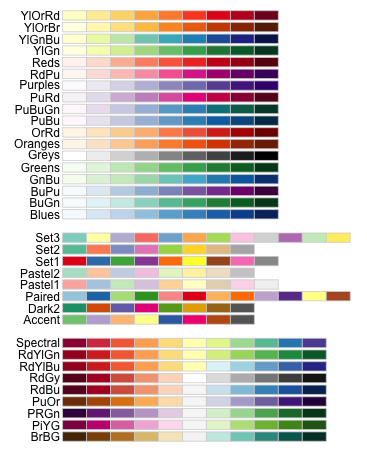
ggplot() パレット

library(RColorBrewer)
display.brewer.all()

上記コードを実行することで使用可能なパレットを取得できる。’

R ggplot() 色見本

2019年9月4日水曜日

ggplot() geom_point() geom_amooth() aes(color= )

## codes start sample#1

w <- (to.monthly(SP5)[,4]/to.monthly(SP5)[,1])["1970::2018"]
w <- w-1
# w <- (apply.monthly(SP5[,4],sd)/apply.monthly(SP5[,4],mean))["1970::2018"]
d <- na.omit(diff(cli_xts$oecd,5))["1970::2018"]
func <- function(x){
  if(x > 0.1){return("upper")}
  if(x > 0){return("uppermiddle")}
  if(x > -0.1){return("lowermiddle")}
  if(x < -0.1){return("lower")}
}
df <- data.frame(monthlyreturn=as.vector(w),delta=as.vector(d),sign=as.vector(apply(diff(cli_xts$oecd)["1970::2018"],1,func)))
p <- ggplot(df, aes(x=delta,y=monthlyreturn,color=sign))
p <- p + geom_point(alpha=0.5)
p <- p + geom_smooth(method = "lm")
plot(p)

## codes end here

sample #1


## codes start sample#2

w <- (to.monthly(SP5)[,4]/to.monthly(SP5)[,1])["1970::2018"]
w <- w-1
# w <- (apply.monthly(SP5[,4],sd)/apply.monthly(SP5[,4],mean))["1970::2018"]
d <- na.omit(diff(cli_xts$oecd,5))["1970::2018"]
func <- function(x){
  if(x > 0.1){return("upper")}
  if(x > 0){return("uppermiddle")}
  if(x > -0.1){return("lowermiddle")}
  if(x < -0.1){return("lower")}
}
df <- data.frame(monthlyreturn=as.vector(w),delta=as.vector(d),sign=as.vector(apply(diff(cli_xts$oecd)["1970::2018"],1,func)))
p <- ggplot(df, aes(x=delta,y=monthlyreturn))
p <- p + geom_point(alpha=0.5,aes(color=sign))
p <- p + geom_smooth(method = "lm")
plot(p)

## codes end here

sample #2


## codes start sample#3

w <- (to.monthly(SP5)[,4]/to.monthly(SP5)[,1])["1970::2018"]
w <- w-1
# w <- (apply.monthly(SP5[,4],sd)/apply.monthly(SP5[,4],mean))["1970::2018"]
d <- na.omit(diff(cli_xts$oecd,5))["1970::2018"]
func <- function(x){
  if(x > 0.1){return("upper")}
  if(x > 0){return("uppermiddle")}
  if(x > -0.1){return("lowermiddle")}
  if(x < -0.1){return("lower")}
}
df <- data.frame(monthlyreturn=as.vector(w),delta=as.vector(d),sign=as.vector(apply(diff(cli_xts$oecd)["1970::2018"],1,func)))
p <- ggplot(df, aes(x=delta,y=monthlyreturn))
p <- p + geom_point(alpha=0.5,aes(color=sign))
p <- p + geom_vline(xintercept =as.vector(last(diff(cli_xts$oecd,5))),size=0.5,linetype=2,colour="white",alpha=0.5)
p <- p + geom_smooth(method = "auto")
plot(p)

## codes end here

sample #3
# addtional cli 1month delta vs. 1 month return. sample scale_color_brewer

w <- apply.monthly(SP5[,4],mean)["1970::2018"]/as.vector(apply.monthly(SP5[,4],mean)["1969-12-01::2018-11-30"])
w <- w-1
# w <- (apply.monthly(SP5[,4],sd)/apply.monthly(SP5[,4],mean))["1970::2018"]
d <- na.omit(diff(cli_xts$oecd,1))["1970::2018"]
func <- function(x){
  if(x > 1){return("a")}
  if(x > 0){return("b")}
  if(x > -1){return("c")}
  if(x < -1){return("d")}
}
df <- data.frame(monthlyreturn=as.vector(w),delta=as.vector(d),sign=as.vector(apply(diff(cli_xts$oecd,5)["1970::2018"],1,func)))
p <- ggplot(df, aes(x=delta,y=monthlyreturn))
p <- p + geom_point(alpha=1,aes(color=sign))
p <- p + geom_smooth(method = "auto")

p <- p +scale_color_brewer(palette="Spectral",na.value = "grey50",name = "CLI 5 mon. Delta", labels = c("upper","uppermiddle","lowermiddle","low"))
plot(p)


2019年9月3日火曜日

ggplot() geom_point() 散布図


月間変動係数 vs. Composite Leading Indicator 5 months delta.
##  codes begin

w <- (apply.monthly(SP5[,4],sd)/apply.monthly(SP5[,4],mean))["1970::2018"]
d <- na.omit(diff(cli_xts$oecd,5))["1970::2018"]
func <- function(x){
  if(x > 0.1){return("upper")}
  if(x > 0){return("uppermiddle")}
  if(x > -0.1){return("lowermiddle")}
  if(x < -0.1){return("lower")}
}
df <- data.frame(sd=as.vector(w),delta=as.vector(d),sign=as.vector(apply(diff(cli_xts$oecd)["1970::2018"],1,func)))
#           sd    delta sign
# 1 0.02741634 -0.80305    m
# 2 0.01305567 -0.83870    m
# 3 0.01308169 -0.86574    m
# 4 0.03515768 -0.87581    m
# 5 0.04406664 -0.85544    m
# 6 0.02212387 -0.79926    m
p <- ggplot(df, aes(x=delta,y=sd,color=sign))
p <- p + geom_point(alpha=0.5)
# p <- p + geom_smooth(method = "lm")
plot(p)

## codes end


月間騰落率 vs. Composite Leading Indicator 5 months delta.
## codes begin

w <- (to.monthly(SP5)[,4]/to.monthly(SP5)[,1])["1970::2018"]
w <- w-1
# w <- (apply.monthly(SP5[,4],sd)/apply.monthly(SP5[,4],mean))["1970::2018"]
d <- na.omit(diff(cli_xts$oecd,5))["1970::2018"]
func <- function(x){
  if(x > 0.1){return("upper")}
  if(x > 0){return("uppermiddle")}
  if(x > -0.1){return("lowermiddle")}
  if(x < -0.1){return("lower")}
}
df <- data.frame(monthlyreturn=as.vector(w),delta=as.vector(d),sign=as.vector(apply(diff(cli_xts$oecd)["1970::2018"],1,func)))
p <- ggplot(df, aes(x=delta,y=monthlyreturn,color=sign))
p <- p + geom_point(alpha=0.5)
# p <- p + geom_smooth(method = "lm")
plot(p)

## codes end


ggplot() geom_bar() その4  SPX weekly ROI for the past 69 years.


SPX weekly ROI for the past 69 years. "Sell in May, come on back on St. Leger's Day." seems to be highly reasonable.

## codes begin

len <- length(index(to.weekly(SP5)))
w <-  to.weekly(SP5)[,4][2:len]/as.vector(to.weekly(SP5)[,4][1:(len-1)])
w <- w-1
weekloc <- floor(length(seq(as.Date(paste(year(Sys.Date()),"-01-01",sep="")),Sys.Date(),by="days"))/7)
weekorder <- c(last(seq(1,52,1),weekloc),head(seq(1,52,1),52-weekloc))
mtrx <- matrix(last(w,floor(length(w)/52)*52),nrow=52)
df <- data.frame(data=apply(mtrx,1,mean)[weekorder],mon=factor(seq(1,52,1)))
p <- ggplot(df, aes(x=mon,y=data,fill=mon)) 
p <- p + scale_x_discrete(label=as.character(seq(1,52,1)))
p <- p + geom_bar(stat = "identity") # need identity to draw value itself. 
p <- p + theme(legend.position = 'none')  # erase legend
plot(p)

## codes end


2019年9月2日月曜日

ggplot() geom_histgram ggplotを使用したヒストグラム

 
!!!CAUTION!!!

!「行列はベクトルなので、すべての要素は同じ型でなければならない。numeric型と character型 のように、異なる型のデータを含む行列を使いたい場合は、データフレームを利用する」

The sample #1 connects rows #1 contains "numeric" and #2 does "character", the matrix of output is forced to standardize all elements into a single data type. In this case the data type is set to "character" as it is more flexible than the other. the data is eventually converted to "factor" in dataframe and it causes the data handling issue in geo_histogram(), which expects continuous data type like numeric as parameter. the data type "factor" is discrete. it requires <stat="count"> and it blocks to display all data in a sigle array which includes defunct parts.

## codes start here sample #1
# use sample #2 rather than #1.

w <- apply.monthly(SP5[,4],sd)/apply.monthly(SP5[,4],mean)
# use round() with digits parameter to adjust binwidth. somehow bandwidth parameter doesn't work at all.
# DON'T DO THIS, UNLESS TO TREAT DATA AS DESCRETE. USE SAMPLE#2
x <- rbind(
cbind(round(as.double(w["1970::2018"][diff(cli_xts$oecd)["1970::2018"] > 0]),digits=3),rep("p",length(round(as.double(w["1970::2018"][diff(cli_xts$oecd)["1970::2018"] > 0]),digits=3)))),
cbind(round(as.double(w["1970::2018"][diff(cli_xts$oecd)["1970::2018"] < 0]),digits=3),rep("m",length(round(as.double(w["1970::2018"][diff(cli_xts$oecd)["1970::2018"] < 0]),digits=3))))
)
y <- data.frame(x)
colnames(y)[1] <- "data"
colnames(y)[2] <- "sign"
p <- ggplot(y, aes(x=data))
# should insert start="count" here to avoid error message.
p <- p + geom_histogram(aes(fill=sign),stat="count",position = "identity", alpha = 0.5)
plot(p)


## codes end here.

sample #1 a case of discrete??

## codes start here sample #2
# round() might not be necessary anymore. keep here as it is harmless.

w <- apply.monthly(SP5[,4],sd)/apply.monthly(SP5[,4],mean)
func <- function(x){if(x > 0){return("p")}else{return("m")}}
# as.vector(apply(diff(cli_xts$oecd)["1970::2018"],1,func))
y <- data.frame(data=round(as.vector(w["1970::2018"]),digits=3),sign=as.vector(apply(diff(cli_xts$oecd)["1970::2018"],1,func)))
# parameter ase() better be put into a single line.
p <- ggplot(y, aes(x=data,fill=sign))
p <- p + geom_histogram(bins=50,position = "identity", alpha = 0.5)
plot(p)

## codes end here

sampel #2 a case of continous

## code start here sample #3
#  position = "fill"
#  use sample #2 until here

p <- ggplot(y, aes(x=data,fill=sign))
# should insert start="count" here to avoid error message.
# p <- p + geom_histogram(stat="count",position = "identity", alpha = 0.5,bins=60)
p <- p + geom_histogram(bins=50,position = "fill", alpha = 0.9)
plot(p)

## code end here.

sample #3 position="fill"

## codes start sample #4

w <- (apply.monthly(SP5[,4],sd)/apply.monthly(SP5[,4],mean))["1970::2018"]
d <- na.omit(diff(cli_xts$oecd,5))["1970::2018"]
func <- function(x){
  if(x > 0.1){return("upper")}
  if(x > 0){return("uppermiddle")}
  if(x > -0.1){return("lowermiddle")}
  if(x < -0.1){return("lower")}
}
df <- data.frame(sd=as.vector(w),delta=as.vector(d),sign=as.vector(apply(diff(cli_xts$oecd)["1970::2018"],1,func)))
p <- ggplot(df,aes(x=sd))
p <- p + geom_histogram(aes(fill=sign),position = "identity", alpha = 0.3,bins=120)
# p <- p + geom_point(alpha=0.5)
# p <- p + geom_point(alpha=0.5, aes(color=sign))
# p <- p + geom_smooth(method = "lm")
plot(p)

## codes end

sample #4 coef. of variance by cli 5month delta


sample #5 position="stack" and alpha=0.9


2019年9月1日日曜日

ggplot() ggplot2を使用した棒グラフ その3

!!CAUTION!!

Codes listed in this article are intended to calculate Standar Deviation or Cor. of Variation of August of each year. They work only in August as fixed length parameter such as "325" is used in many places until the day codes are updated to automatically caluculate the length of data array.

## codes begin.

ggplot 
 data.frame(data=matrix(as.vector(last(apply.monthly(SP5[,4],sd),325)[seq(1,325,12)]/last(apply.monthly(SP5[,4],mean),325)[seq(1,325,12)]),nrow  = 28),mon=as.character(seq(1992,2019,1))),aes(x=mon,y=data,fill =mon)) +
 scale_x_discrete(label=seq(1992,2019,1)) +
 stat_summary(fun.y=NULL,geom="bar") + # speciy "bar" graph
 theme(legend.position = 'none')

## codes end.

Below is updated to handle flexible number of months and years.

## codes begin

yearlen <- length(seq(1992,year(Sys.Date()),1))
monthlen <- length(index(apply.monthly(SP5[,4],sd)["1992::"]))
# put 1 to 12, which means Jan. to Dec.
startmon <- 8
# check start month is already in the past or not. if not the expected number of years
# to calculate is smaller by 1.
if(startmon <= month(last(index(apply.monthly(SP5[,4],sd)["1992::"])))){p <- 0}else{p <- 1}
df <- data.frame(
  data=as.vector(apply.monthly(SP5[,4],sd)["1992::"][seq(startmon,monthlen,12)]/apply.monthly(SP5[,4],mean)["1992::"][seq(startmon,monthlen,12)]),
  mon=as.character(seq(1992,year(Sys.Date())-p,1)))
p <- ggplot(df,aes(x=mon,y=data,fill=mon))
p <- p+geom_bar(stat = "identity")
p <- p+scale_x_discrete(label=seq(1992,year(Sys.Date()),1)) 
# p <- stat_summary(geom="bar") 
# p <- p+theme(legend.position = 'none')
plot(p)

## codes end


sample #1

## codes begin.

x <- data.frame(
   year  = 1992:2019,
   CoefficientofVariation = as.vector(last(apply.monthly(SP5[,4],sd),325)[seq(1,325,12)]/last(apply.monthly(SP5[,4],mean),325)[seq(1,325,12)])
)
g <- ggplot(x, aes(x = year, y = CoefficientofVariation,fill=year))
# stat = "identity" を忘れるとエラー: stat_count() must not be used with a y aesthetic."が出る
g <- g+geom_bar(stat = "identity")
# scale_x_discrete() doesn't work when x lables are numeric.
g <- g+scale_x_discrete(label=as.character(seq(1992,2019,1)))
# g <- g+theme(legend.position = 'none')
plot(g)

## codes end.

sample #2


## codes begin

x <- data.frame(
   year  = as.character(seq(1992,2019,1)),
   CoefficientofVariation = as.vector(last(apply.monthly(SP5[,4],sd),325)[seq(1,325,12)]/last(apply.monthly(SP5[,4],mean),325)[seq(1,325,12)])
)
g <- ggplot(x, aes(x = year, y = CoefficientofVariation,fill=year))
# stat = "identity" を忘れるとエラー: stat_count() must not be used with a y aesthetic."が出る
g <- g+geom_bar(stat = "identity")
g <- g+scale_x_discrete(label=seq(1992,2019,1)) 
g <- g+theme(legend.position = 'none')
plot(g)

## codes end

this code draw the exactly same graph as the sample#1

for start ="identify", please refer below.

By default, geom_bar uses stat="count" which makes the height of the bar proportion to the number of cases in each group (or if the weight aethetic is supplied, the sum of the weights). If you want the heights of the bars to represent values in the data, use stat="identity" and map a variable to the y aesthetic.


adding factor() to fill parameter to use distinctive colors. otherwise, graduation will be used when y parameter is numelic like "1951:2019". see sample #2.

## codes begin

x <- data.frame(
   year  = 1951:2019,
   CoefficientofVariation = as.vector(last(apply.monthly(SP5[,4],sd),817)[seq(1,817,12)]/last(apply.monthly(SP5[,4],mean),817)[seq(1,817,12)])
)
g <- ggplot(x, aes(x = year, y = CoefficientofVariation,fill=factor(year)))
# stat = "identity" を忘れるとエラー: stat_count() must not be used with a y aesthetic."が出る
g <- g+scale_x_discrete(label=seq(1950,2019,1))
g <- g+geom_bar(stat = "identity")
g <- g+theme(legend.position = 'none')
plot(g)


## codes end

sample #3


ggplot() geom_line


draw line graph.


## start of the code.

 x <- data.frame(
    year  = 1992:2019,
    CoefficientofVariation = as.vector(last(apply.monthly(SP5[,4],sd),325)[seq(1,325,12)]/last(apply.monthly(SP5[,4],mean),325)[seq(1,325,12)])
)
g <- ggplot(x, aes(x = year, y = CoefficientofVariation))
g <- g + geom_line()

plot(g)


## end of the code.


2019年8月28日水曜日

ggplot() data.frame() geom="bar" ggplot2を使用した棒グラフ その2


w <- to.monthly(SP5)[,4][2:836]/as.vector(to.monthly(SP5)[,4][1:835])
w <- w-1
# will use "c(last(seq(1,12,1),month(index(last(apply.monthly(SP5[,4],sd)))) ),head(seq(1,12,1),12-month(index(last(apply.monthly(SP5[,4],sd)))) ))" in the future
#
ggplot(data.frame(data=apply(matrix(last(w,floor(length(w)/12)*12),nrow=12),1,mean)[c(5,6,7,8,9,10,11,12,1,2,3,4)],mon=c("01jan","02feb","03mar","04apr","05may","06jun","07jul","08aug","09sep","10oct","11nov","12dec")),aes(x=mon,y=data,fill =mon)) +
scale_x_discrete(label=c("jan","feb","mar","apr","may","jun","jul","aug","sep","oct","nov","dec")) + #x-axis label
stat_summary(fun.y=NULL,geom="bar") + # speciy "bar" graph
theme(legend.position = 'none')  # erase legend


# the final version

use "c(last(seq(1,12,1),month(index(last(apply.monthly(SP5[,4],sd)))) ),head(seq(1,12,1),12-month(index(last(apply.monthly(SP5[,4],sd)))) ))"
# to calculate the order of months like "c(5,6,7,8,9,10,11,12,1,2,3,4)" for August.
#
len <- length(index(to.monthly(SP5)))
w <- to.monthly(SP5)[,4][2:len]/as.vector(to.monthly(SP5)[,4][1:(len-1)])
w <- w-1
# need factor() to set descrete index, other wise continus/gradation will be used as color scheme.
#
df <- data.frame(data=apply(matrix(last(w,floor(length(w)/12)*12),nrow=12),1,mean)[  c(last(seq(1,12,1),month(index(last(apply.monthly(SP5[,4],sd)))) ),head(seq(1,12,1),12-month(index(last(apply.monthly(SP5[,4],sd)))) )) ],mon=factor(seq(1,12,1)))
p <- ggplot(df, aes(x=mon,y=data,fill =mon)) 
p <- p + scale_x_discrete(label=c("jan","feb","mar","apr","may","jun","jul","aug","sep","oct","nov","dec"))  #x-axis label
p <- p + geom_bar(stat = "identity") # need identity to draw value itself. 
p <- p + theme(legend.position = 'none')  # erase legend
plot(p)